Color & Mood in Comics
As I teased in my Intro to Color for Comics post, later in the semester I like to do a workshop about creative use of color where students are encouraged to really explore unexpected uses of color.
This lesson is all about studying surprising uses of color, coming up with interesting and mood-relevant color schemes, and plotting them in a panel with thought given to light source and focal point.
We start, per usual, with some slides.
As I show students some examples of how color choice changes a single illustration, I ask them to shout out the emotions they get from different color schemes. We start a word bank on the board of different moods you might try to achieve through a panel: despair, hope, imminent peril, and so on.
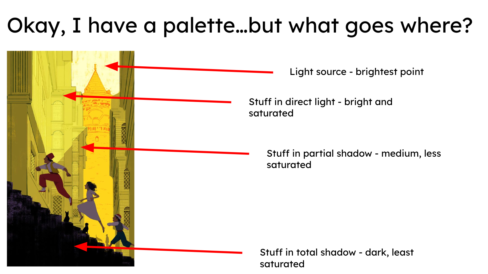
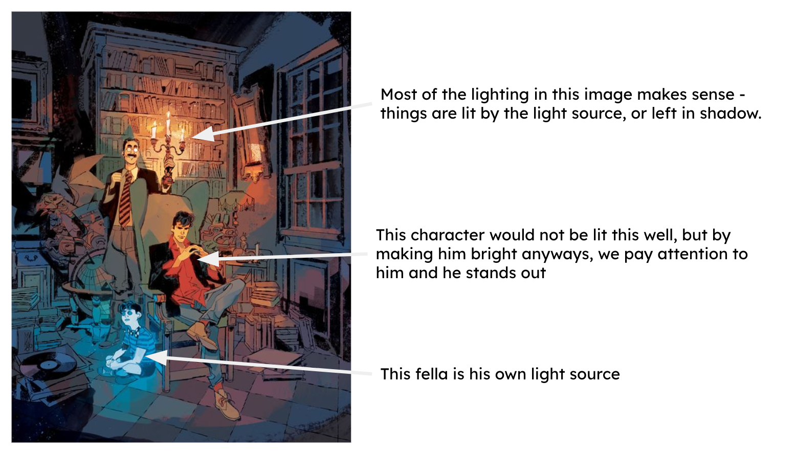
Next, I show some basic techniques for plotting where your colors go in an illustration, based mostly on value. We talk about light source, and how it affects value and saturation.
While we discuss color theory “rules” and concepts, the focus is much more on how to use or break said rules in interesting ways, rather than teaching them concepts and quizzing them on it later. If they turn in a comic during the unit where I see creative, unexpected colors, or even more standard colors plotted really strongly according to light source and focal point, I call it a win.
As we move on to examples of illustrations and comic panels, I provide images where I’ve color picked out the prominent hues and isolated them so students can see the palette, versus the finished piece.
I have these images printed and laminated and we pass them around for inspiration — I love seeing which ones are popular in a given group.
Now that we’ve looked at inspiration, I pop a color palette challenge image from google up on the board - I like to search for it on the screen, so they see how easy they are to find, and how many options there are - and we start using colors.
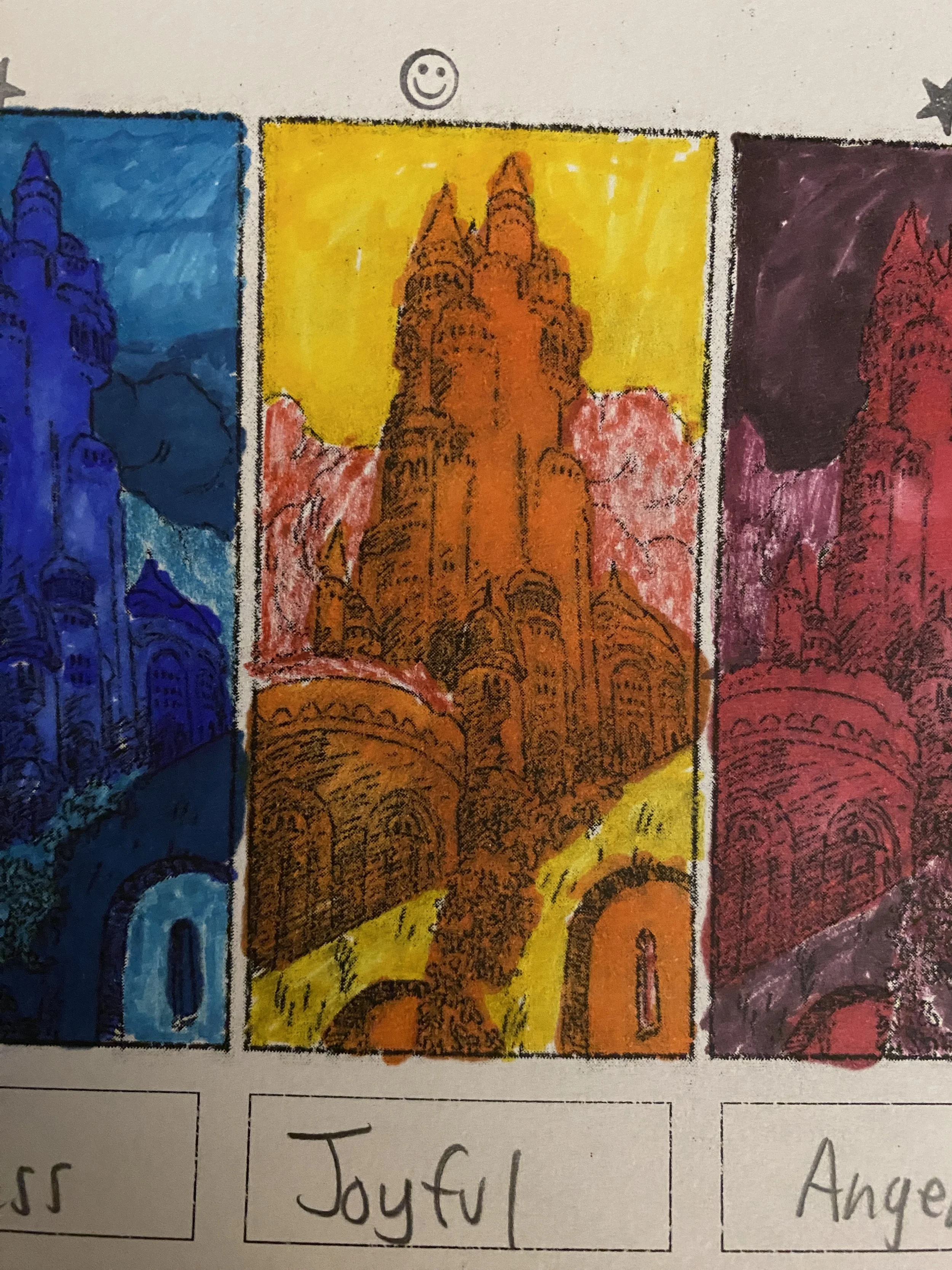
They’re given a 2-page packet, which has the same small inked comic panel 6 times. The assignment: using only 5 colors per panel iteration, create 6 distinct moods in the same lineart. In the box accompanying the panel, write what mood you’re going for.
Students are always really excited about what they come up with in this, and the castle image allows them to choose different interpretations of where a light source might be, and how the shadows might fall.
This activity is always a hit, and I tend to see big growth in their use of color! Please feel free to use, alter, etc. this lesson and its materials, but as always, my resources are NOT to be placed behind a paywall of any kind, whether the graphics are changed or not.
Links:


